


Project #1 Design Grammar
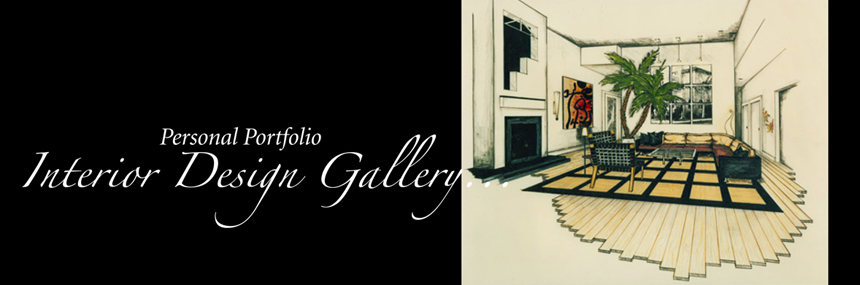
As this interior environment inherited unique urbanus qualities from its multi storey structure, it was determine that “Urbanity” would become the expression emphatique in the design. State of the art architectural detailing and finishes, custom built cabinetry, and factory built furniture were all designed, selected, and specified, with this in mind.
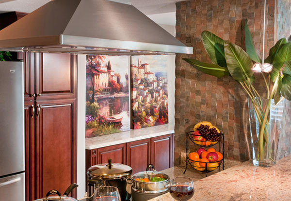
Interiors of this sort however, often exhibit a disconnect with the natural landscape below, so an equally important objective was the grounding of the space. Grounding elements were introduced through the use of earth-borne materials; including ancient metals, quarried stone, rich woods, and natural fibers. The nuptial of these two opposing design objectives is manifest in the constitution of the design, as these earth-borne grounding elements are juxtaposed with modern material products and technologies. There is a forced consonance between the materials themselves and between the materials and the methods of construction. The modern stainless steel that adorns the entry doors for example, is linked to the past by the remembrancers of ancient bronze and copper, as they are introduced in the dining room furniture. The quarried Black Absolute granite in the living room on the other hand, is propelled to the present through the use of modern machine cutting and polishing techniques, as it is transformed from its earthly state into a slick and contemporary version of itself.
This manipulated marriage of nature and technology continues throughout the design. Species of cherry and anigre wood clad the floors and walls respectively. The wall veneer panels however, are sequenced and matched with precision accuracy and then punctuated with polished stainless steel rivets. The interior is graced with the natural fibers of wool, silk, cotton, and leather. However, they are the end products of sophisticated, contemporary processing efforts. The state-of-the- art lighting and electronics, which serve to reinforce the urbane theme, are then softened by the “creature comforts” of down-filled upholstery. The juxtaposing of opposites continues throughout the color palette, as burnt sienna and mustard complement the constant cycle of pale blue days and cobalt nights exhibited in the architectural fenestration.
Project #2 Design Grammar
Located on the ground floor of a beachfront mid-rise, this project possessed magnificent vistas of the Atlantic Ocean. It was decided early in the process that the design parti would revolve around this panorama.
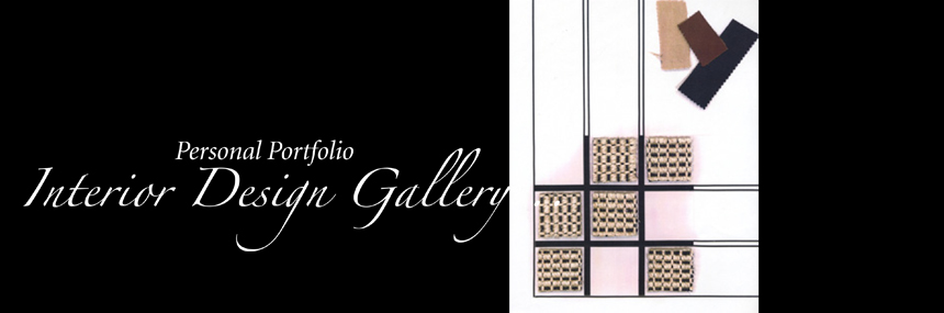
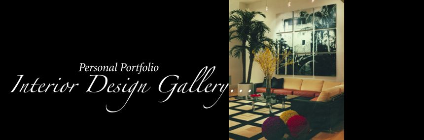
View- inhibiting walls between the entry foyer and living room, and the kitchen and dining room were removed, while new space defining-elements were introduced. Curvilinear soffits mimicking the motion of the sea and a large free-form area rug were to be the new and more subtle means of defining space. In order to reflect the fluidity and movement of the ocean, curvilinear forms became the predominant dynamic. The custom millwork, the custom kitchen cabinetry, and the specified factory-built furniture all reflect this theme. The fluid plot culminates with a huge, custom-designed, sculptural sofa at the center of this open expanse of space.
As all of the partition walls were removed and the load bearing walls contained great expanses of glass, there was not an inch in which to hang a painting. It was determined that a “painting” of carpet fibers would be unfurled across the great breath of floor. The milky white ceramic tile performs like a gessoed canvas; a backdrop from which abstract forms of rich jewel tones and vibrant primaries burst and exude. The custom area rug was inspired by a 27” x 40” mixed media sketch.
Finishes of maple, stainless steel, glass, and sodilite granite clad the furniture, millwork, and architecture. These finishes are enhanced by the ocean tones of electric blue, emerald, and cobalt, as they are celebrated in the fabrics and serve to consummate this interior.
Project #3 Design Grammar
The universal language of design communicates on a theme of ideas such as warm, cool, hard, soft, tense, tranquil, order, disorder, etc. These ideas appeal to sensory perception and (as exhibited in the first two projects) are communicate in design through the subtle manipulation of form, surface, and light. These ideas are abstract and are intended to evoke specific instinctive reactions in the minds of the beholder. However, there also exist vernacular languages of design, which involve cognitive processes rather than instinctive reactions. Here, design articulation is governed by manufactured principles rather than natural ones. Primordial responses become secondary while history and culture become center-stage.
From authentic period English, French, and Italian to intentional ersatz/stage- set American Southwest, vernacular designs encompass the gamut. Sublime antiques or playful props... it is the designer’s choice. As the incongruous objective of this project was to create, in the heart of Boca Raton, Florida, an environment reminiscent of Santa Fe, New Mexico, playful props became the order of the day. Carved wood furniture, pine vigas, and simulated adobe plaster construction all contribute to this diverting charade. Indigenous materials such as forged ironwork, clay pottery, and authentic hand-woven tapestries were also incorporated into the “stage-set”. However, they were interspersed among design understudies such as slate for Arizona sandstone and manufactured “S” tile for authentic handmade terracotta barrel tile.
The amusement begins at the courtyard threshold, as it is there that the sub- tropic realm of South Florida is left behind and transmigration into the desert of the American Southwest begins.
Project #4 Design Grammar
The Design parti for this project was based on a graduate school assignment, “back in the day”, given by visiting professor, Collin Rowe at the University of Florida. The objective was essentially to create a “Vecenza Style” Villa utilizing the principles set forth by Palladio in the Quatro Libri... while at the same time appeal to modern day sensibilities pertaining to aesthetic and function.
This project was for my mother Roseanne, Manganelli who is a true italophile and extremely talented in her own right. The project became a family affair, including my sister, Denise Denecke (also an interior designer, and a very talented one I might add) and, of course my husband Dan.
The architectural envelope and the interior space plan were to be defined by many of these principles. The plan was to have a center-symmetry axis with a center hall, and a clear and continuous circulation pattern (ingress/ egress) throughout the living areas. It was determined that all interior proportions would be based on Phi- 1.618 (The Golden Section) and all interior furnishings and decorations were to be respectful of traditional villa design.
The challenge was to incorporate a Piano Nobile (main floor) at the second storey level and the secondary floor (containing minor rooms) at the ground level. The Piano Nobile was to be reached from the exterior by a “half flight” grand stair entrance reminiscent of the Villa Capra “La Rotonda”. The full flight interior level change was to be assisted on the exterior by sloping terrain (away from the building at the back and side) to allow for the lower floor level to be at ground level in those locations.
The Piano Nobile was to consist of a Foyer, Living Room, Dining Room, Kitchen, Breakfast Room, Family Room (with access to a terrace), Master Suite and Bath, and Powder Room. Also a Conservatory style Dining Room was to be incorporated into the plan.
The Secondary (ground level) floor was to consist of 2 Guest Bedrooms, full Bathroom, and a Living Room Area with French door access to a ground level Patio.
The Space Planning challenge was the most interesting part of the Interior Design program... But equally as challenging, were the budgetary constraints for the decorative finishes; carpet and ceramic tile became substitutes for marble and wood, and plastic laminate (in some areas) for granite.
Large reproduction frescos (printed on stretched canvases) were hung in the living room as remembrancers of the magnificent painted embellishments of actual Vecenza villa interiors... and a large precast “16th century style” fireplace was installed in the family room, reminiscent of that erected at the Villa Da Porta Colleoni (Thiene, Vicenza). The serpentine staircase in the living room was loosely based on that at the Musee Carnavalet, Paris (albeit inverted)... and the Conservatory/Dining Room was truly a pastiche of the Grand Court at Ca d’ Zan.
Donna's Personal Portfolio
Maecenas tempus, tellus eget condimentum rhoncus, sem quam semper libero, sit amet adipiscing sem neque sed ipsum. Nam quam nunc, blandit vel, luctus pulvinar, hendrerit id, lorem. Maecenas nec odio et ante tincidunt tempus. Donec vitae sapien ut libero venenatis faucibus. Nullam quis ante. Etiam sit amet orci eget eros faucibus tincidunt. Duis leo. Sed fringilla mauris sit amet nibh. Donec sodales sagittis magna. Sed consequat, leo eget bibendum sodales, augue velit cursus nunc,

